Launching a new ecommerce brand across borders

SEKO Logistics
Brand Development

Launching a new ecommerce brand across borders

SEKO Logistics
Brand Development

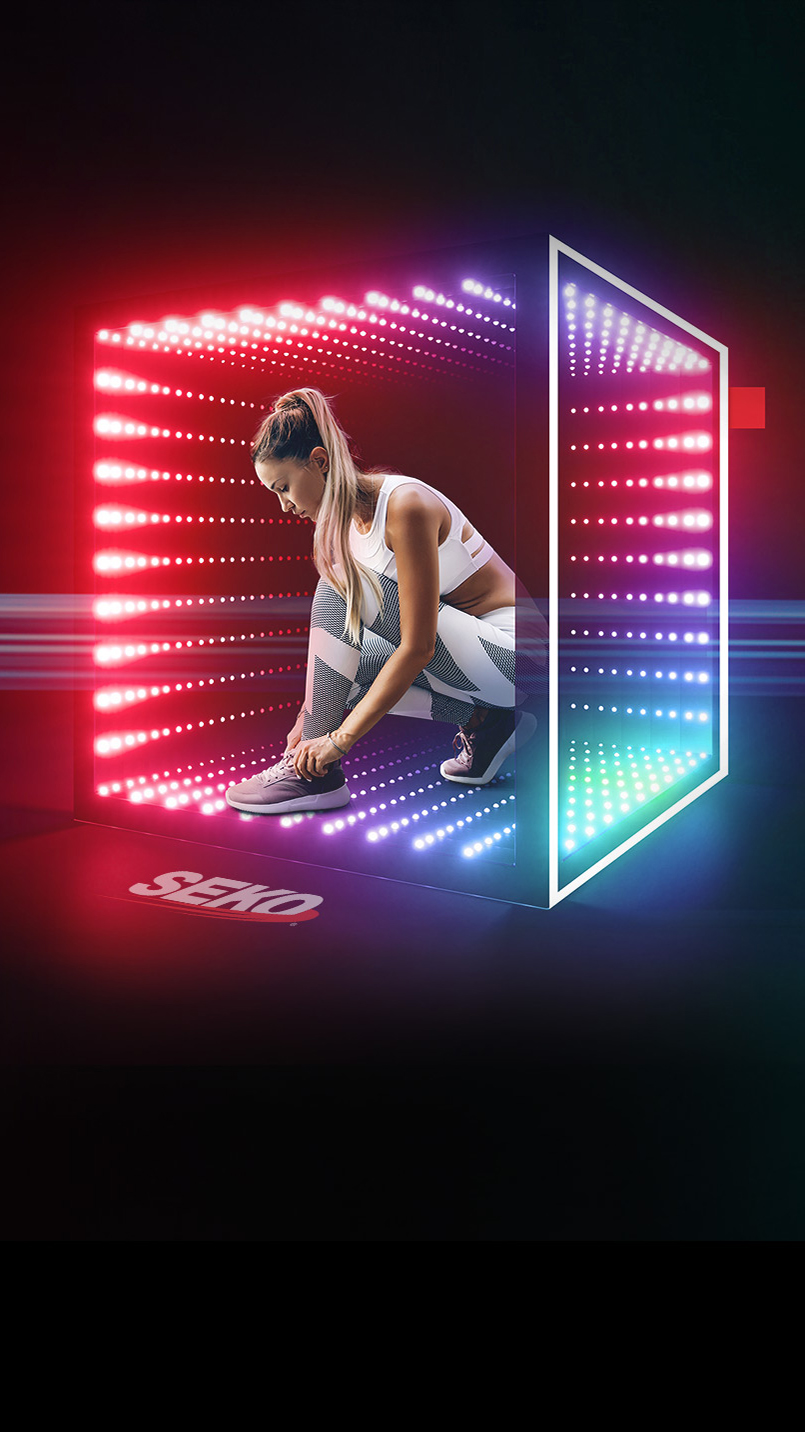
SEKO has been a leader in logistics for over four decades, not to mention a client of ours for over half of that time. After launching as a new division, SEKO Ecommerce required an identity that retained a strong connection to the parent brand but could make its own mark within the industry.

The Project

Since the four pillars of SEKO Ecommerce naturally aligned to the sides of a square, ‘The Box’ emblem provided a great opportunity to evolve the triangular style of the primary brand, while representing the typical shape of a parcel. The small red tag in the corner also paid homage to SEKO as parent company, while serving as a true mark of excellence. Whether it was coming to life in the launch animation or expanding into our vibrant hero imagery, ‘The Box’ provided an incredible visual mechanism to showcase everything SEKO Ecommerce.
Brand | Web | Digital | Social | Animation | Copywriting

"Shine totally transformed SEKO’s traditional branding and took it to the next level; developing a new vibrant stand-out Ecommerce creative and launch strategy. Thinking ‘outside the box’, the Shine team went above and beyond to execute. Huge kudos to the team!"

Dave Emerson - Chief Commercial Officer EMEA, SEKO Logistics
Inspiration, founded on traditional values
hello@shinecreative.co.uk